

How to read stock charts as a long-term investor, you only need four things: the price line over a long time frame, the volume bars beneath it, a moving average or two for trend and the overall direction the chart is heading.
Author: Aditya Pareek | EQMint
You don’t need candlestick patterns, RSI divergences or any of the dozens of indicators day traders stack on their screens. A stock chart is a picture of price over time, and for someone buying to hold, its job is simply to show you the trend, the trading range and whether interest is building or fading. That’s readable in about two minutes per stock.
Most chart guides are written by traders for traders, drowning beginners in jargon they’ll never use. This one is the opposite.
Here’s what actually matters on a how to read stock charts for a long-term investor, what to safely ignore and how to read one in two minutes.
What a stock chart actually shows
Strip away the decoration and a chart has two axes. Time runs along the bottom, price up the side. The line or bars in between trace what the stock cost at each point.
That’s the whole foundation. Everything else (indicators, patterns, overlays) is just a different way of summarising that same price-over-time information.
For a long-term investor, the single most important setting is the time frame. A 1-day chart is noise. Zoom out to 1 year, 5 years and the maximum available, and the real story appears: is this company worth more or less than it was over a meaningful stretch of time?
Line chart vs candlestick, which should a beginner use?
Take a clear position. For a long-term investor, the line chart is not just adequate, it’s better.
A line chart connects closing prices into a single clean line. It shows trend and direction with zero clutter, which is exactly what a buy-and-hold investor wants to see.
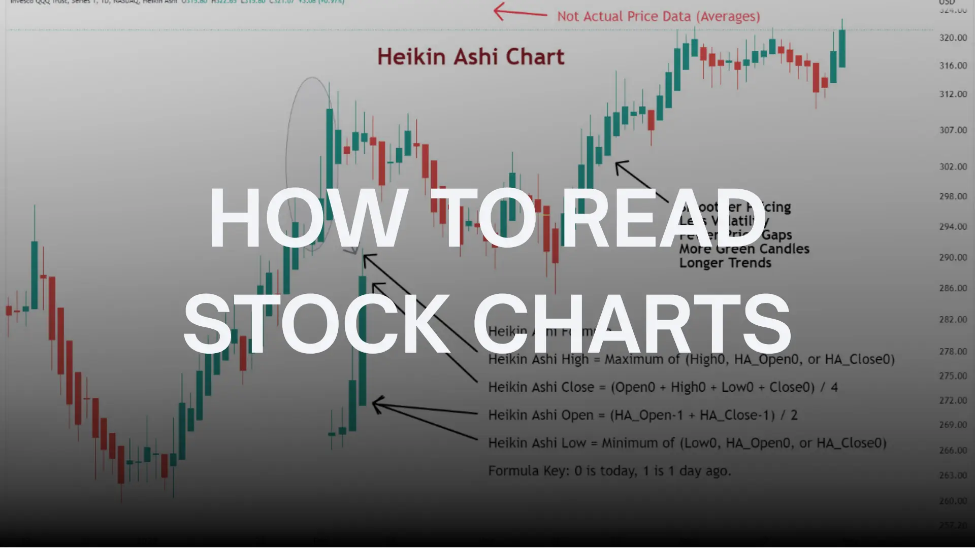
A candlestick chart packs four numbers into each bar (open, high, low, close) and is built for traders timing entries to the day or hour. The patterns have evocative names and a whole mythology around them, and for someone holding a stock for years, almost none of it matters. Reading candlesticks to make a multi-year investment decision is using a stopwatch to measure the seasons.
Start with the line chart. Switch to candlesticks only if you ever genuinely take up short-term trading, which most investors neither need nor should.
The four things worth reading
Here’s the entire toolkit a long-term investor needs. Four things, no more.
| What to look at | What it tells you |
| The trend (zoomed out) | Is the company worth more over years, or less? |
| The trading range | The high and low band the price has moved within |
| Volume bars | Whether buying or selling interest is real or thin |
| A moving average | The smoothed direction, ignoring daily noise |
The trend. Zoom out to 5 years or more. A chart sloping up over years means the market has steadily valued the company higher. A long, grinding decline is a question worth answering before you buy, not after.
The trading range. Notice the rough high and low the stock has bounced between. It tells you whether today’s price sits near the top, the bottom or the middle of where it’s traded, which is useful context for what you’re paying.
Volume. The bars at the bottom show how many shares changed hands. A big price move on heavy volume is more meaningful than the same move on thin volume, because more people backed it. Volume is the conviction behind the price.
A moving average. This single line smooths out the daily jumps to show the underlying direction. The 50-day and 200-day moving averages are the common ones. Price holding above its 200-day average broadly signals a healthy long-term uptrend. That’s about as much indicator as most investors ever need.
What you can safely ignore
Be blunt here, because this is where beginners waste months. Most of what fills a trader’s screen is irrelevant to someone holding for years.
You can skip candlestick patterns with exotic names, RSI and stochastic oscillators, MACD crossovers, Fibonacci retracements, Bollinger Bands and Elliott Wave counts. None of these help you decide whether a company is a good business to own for the next decade. They’re tools for timing short-term trades, a game with its own steep failure rate.
The honest point. A stock chart cannot tell you if a company is a good investment. It shows you price history, not business quality. For that you read the financials, the P E ratio, the debt, the management. The chart is context, never the verdict.
How to read a chart in two minutes
A simple routine for any stock you’re considering.
First, set the time frame to 5 years or maximum. Glance at the overall slope. Up, down or sideways over the long haul?
Second, check where today’s price sits within the range. Near the highs, near the lows or in the middle?
Third, look at the volume bars under recent moves. Are big moves backed by heavy volume, or are they thin and unconvincing?
Fourth, add the 200-day moving average and see whether price is above or below it. Above suggests a healthy long-term trend, below suggests caution.
That’s it. Two minutes gives you the context you need, and then you turn to the financials for the decision that actually matters.
Where to find clean charts in India
All free, all reliable. Screener.in shows clean price charts alongside the financials, which keeps you focused on fundamentals. TradingView offers powerful charts with a free tier, useful if you want moving averages without clutter. Your own broker’s app (Zerodha Kite, Groww, Upstox and others) has built-in charts that are more than enough for a long-term investor.
Pick one, set it to a long time frame and resist the urge to flip to the 5-minute view. That urge is the start of pretending you’re a day trader, which is the one thing this guide is built to help you avoid.
FAQ
How to read stock charts as a beginner?
Set the chart to a long time frame like 5 years, look at the overall trend, check where today’s price sits in the trading range, glance at volume and add a 200-day moving average. That covers what a long-term investor needs.
Should beginners use line charts or candlesticks?
Line charts. They show trend and direction cleanly, which is what a buy-and-hold investor needs. Candlesticks pack in detail built for short-term traders timing entries to the day.
What is volume on a stock chart?
The bars at the bottom showing how many shares were traded. A price move on heavy volume carries more conviction than the same move on thin volume.
What is a moving average?
A line that smooths out daily price swings to show the underlying direction. The 50-day and 200-day are common. Price holding above its 200-day average broadly signals a healthy long-term uptrend.
Do I need indicators like RSI and MACD?
Not as a long-term investor. These are short-term trading tools. The trend, range, volume and a moving average are enough for buy-and-hold decisions.
Can a stock chart tell me if a company is a good investment?
No. A chart shows price history, not business quality. To judge whether a company is worth owning, you read the financials, valuation, debt and management. The chart is context, not the verdict.
What time frame should I look at?
Five years or the maximum available. Short time frames like one day are mostly noise. Zooming out reveals whether the company has grown in value over a meaningful period.
Where can I find free stock charts in India?
Screener.in, TradingView’s free tier and your own broker’s app such as Zerodha Kite, Groww or Upstox all offer clean, reliable charts at no cost.
EQMint is not a SEBI registered investment adviser. This article is for informational purposes only and is not investment advice.
For more such information visit EQMint
Join our Whatsapp channel for timely updates: Whatsapp